When producing a film, a title for the picture must be chosen as the name the film will be known by. When creating a title for a film, many typically choose a title that is related to what happens in the film, the name of the character the film follows or a specific word or phrase to set the mood of what the film is trying to portray.
Along with the title of the movie potentially foreshadowing the tone and future events
Along with the title of the movie potentially foreshadowing the tone and future events
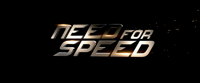
The font chosen for the film Need For Speed is a very slick and futuristic like choice. To a viewer, this title and the font alongside gives the connotations that the film is most likely to have heavy use of vehicles, specifically top of range expensive cars. As the title has been placed in an italic like position along with the font it gives the impression of it being aerodynamic and fast relating to the use of of cars and the theme of speed. The lighting glare featured on the lettering of the title could represent the brand new cars that are usually featured in this movie series as they always show them off with good lighting to get the signature brand new glare of light coming off the cars exterior metal plates.
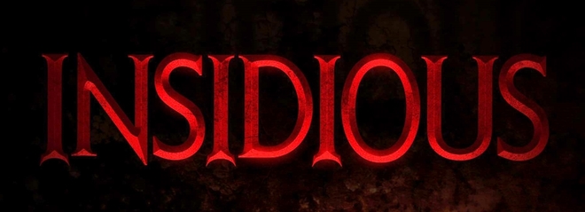
The title of 'Insidious' gives the viewer the connotations of that something really bad is going to happen in this movie, whether it be an event or action taken by one of the characters or something will happen to them and it will take the movie into a very dark turn. The choice of the very dark almost blood red hue to the colour gives the instant connotation of danger, blood and possibly death, a good connotation set for a horror movie. The way the lettering curves at the ends of the letters also references imagery of devil horns or the devils pitch fork portrayed in media, this relates to the demonic element of the film.
Our own working title and design of 'Erased' features a very sleek and minimalist look to it. The idea behind the minimalist text design is so that the title doesn't look too unprofessional. The sleek design makes the title look more professional while also retaining the sense of safety we want to convey in the title due to the concept of the story-line we will try to convey to the viewer in the Opening Title Sequence. The Opening Title Sequence is going to focus on the Supernatural element and the happenings occurring in a place of safety. The silver colouring was also chosen for this purpose of conveying safety to the viewer.
