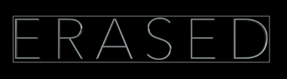
For our Opening Title Sequence we decided on the title font being 'Minimal 3D'. We chose this font type because of its thin and slick design. The colour and design gives off a more safe and modern style not usually associated with Horror. The title gives the connotations of something very mysterious.
The title fades out of the shot relating to the idea and name of the main character being 'Erased'.
The title fades out of the shot relating to the idea and name of the main character being 'Erased'.
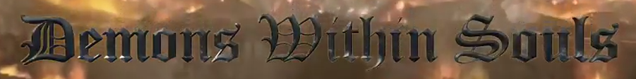
In our Production Company logo we decided to try and find a font style that we thought fit with the actual name of our Production Company. We ended up going with the font 'Forged' . We decided on this font because it looked quite medieval in style and thought it really fit what was going on the background of the title.
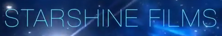
In the Distribution Company logo we decided on the font of 'Ultra Light'. We chose Ultra Light because it was very simple and easy to read amongst the background.
